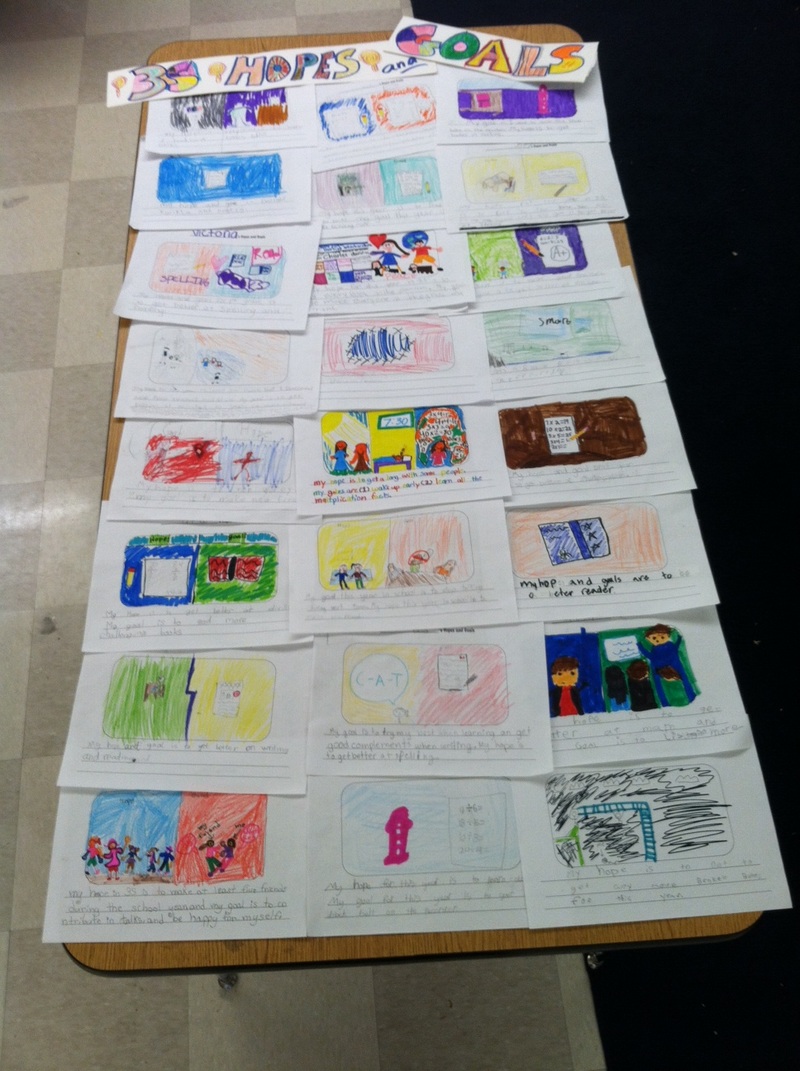
We prepared for your visit by creating Hopes and Goals for you to read. We illustrated them and hope they create a welcoming and cheerful display in our classroom.
|
|
We prepared for your visit by creating Hopes and Goals for you to read. We illustrated them and hope they create a welcoming and cheerful display in our classroom.
0 Comments
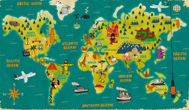 What does the map above show us? What purpose did the map's author(s) -- and publisher(s) -- have in mind? How is it different from other maps? How is it similar to maps such as the one below? Note: the above map can be found online by clicking the button below that reads "CREATIVE WORLD MAPS LINK". 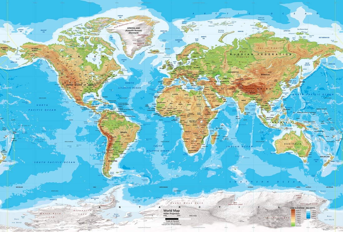 Maps are created, published, and maybe even sold for many different purposes. Many of us found reasons to like maps such as the one at the top of this post that includes many images and symbols representing notable structures or maybe famous cultural or historical icons that helped us imagine or guess what might be interesting or important about certain places. The other map (linked by the button above entitled "World Map for Schools") can be purchased for instructional use. Taking some time to view it together as it was projected on our SmartBoard today, we started noticing and listing things that we recognized and understood from looking at it and using the legend (or key).
Here is how I listed our observations as we shared them in a whole-class discussion:This map shows... the whole world (flattened out -- it isn't a globe)! Also... countries and continents (boundaries) cities and states and national capitals landforms (grasses, deserts, mountain ranges, ice and snowy ground); higher and lower grounds (valleys and hills) -- this map even showed some particular peaks (like Mt. Everest) waterways (like rivers), and large bodies of water (oceans, rivers, lakes, seas, gulfs, and bays); shallower / deeper places in the water Our geography lesson concluded with an interactive read-aloud of the book How I Learned Geography by Uri Shulevitz. How did you learn geography? Which map would you prefer to hang in your home? What about to hang one in our classroom? What do maps show us, and why might we use one? 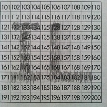 Can you figure out how we knew which boxes on the chart to shade in?
Here's what we did: As our math students examined a portion of a 300 chart today, they were looking for numbers that were placed incorrectly. Each square that contained a number that didn't fit in the sequence was to be shaded in. There were questions kids asked when they found a number that didn't fit, such as, "If this number doesn't fit, should the next one be the one that was skipped in the previous box?" Students needed to see the structure of the chart to know which numbers were in the proper places regardless of the ones that were shaded (since they were "wrong"). Looking at the ones' place and noticing the way the same digits were found there in each column was one strategy. The tens' place was sometimes needed to help when the proper digit was in the ones place, but the number still didn't belong. Looking across the rows, there was a new digit appearing in the tens' place at a certain location. How could this "odd" occurrence be explained in the sturcture of this particular chart? Is there another chart structure that could be used where there isn't an exception to deal with in each row? Finally, there will be some who know that "IL" is no longer the state with the tallest building in the US. I became curious about what year was the last one when a tower in the state hinted at above was the tallest in the US? When and why did that structure have its name changed? How soon will it be before our own tallest building in Boston undergoes a similar and-change fate? For information from Wikipedia about today's tallest US skyscrapers, you can follow the link below. Feel free to comment, also, as this is the first post to this new blog! |
